
The end of the school year is a great time to take stock of your after school program, celebrating what went well and setting course to get even better in the future.
It can be tough to wade through the data on hand. Too often, when teams sit down to get clear about what their data is saying, they struggle to figure out what really matters and what do to next.
Use this three-step method to make more meaning of your data:
Scan
Start by getting a 10,000-foot view of your data landscape. This will help your team to make better-informed decisions about which aspects of your program deserve a deeper dive.
Ask: Which of our measures are particularly high? Which are particularly low? What connections do we see among the high-rated measures, and the low?
For example, if your after school program is not fully enrolled, youth surveys show kids are dissatisfied with the hands-on opportunities in your program, and site observations show limited opportunities for kids to interact with materials… you’ve got a pattern on your hands.
Once you’ve reviewed your data landscape, pick one, maybe two, patterns to investigate further.
Check out Public Profit’s guide, Dabbling in the Data for fun team-based games to conduct your scan. High/Low and Mind the Gap are particularly useful.
Analyze
Now it’s time to figure out what’s driving the patterns you picked in the Scan phase. Push yourself and your team to get to the underlying reasons, since this will help you to identify specific, actionable issues to address.
A few of our favorite activities to do this include Five Whys and Iceberg Analysis. In Five Whys, state the pattern you observe, then to ask “why?” five times. It’s a great way to get beyond surface observations.
Iceberg Analysis is similar. Draw an iceberg on chart paper. The tip of the iceberg is the thing you observe, the part of the iceberg that’s under the water are the factors driving that outcome. So the tip of your iceberg may be low enrollment, and what’s beneath are things like the mix of activities you offer, emotional safety, and opportunities for kids to lead.
Dabbling in the Data has other activities to consider for this phase, like Easy as Pie and Force Field Analysis.
Prioritize
Your team will need to focus on doing just a few things differently if you really want to change. Use what you learned from the Analyze phase to identify the highest value opportunities to make a lasting change.
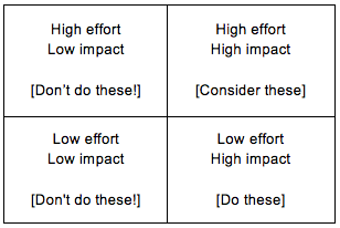
One way to do this is to use a Magic Quadrant. It’s a time-tested, easy, way to sort through different options. In this case, we’ll use a Magic Quadrant to map our options based on how much effort they’ll take, and how likely they are to have an impact. All you need is a chart paper, markers, and post-its.
Draw a table with four cells. The upper right hand cell is for options that will take a lot of effort and will have a lot of impact. The lower right hand cell is for options that don’t take as much effort, but will have a lot of impact. Top left is for ideas with lots of effort and limited impact, and bottom left is for options with limited effort and limited impact.
Write the different options on post-it notes, and put them on the appropriate part of the table. Disregard options on the left. For the options on the right, consider carefully the ones in the upper right hand corner (high effort, high impact) and definitely do the ones in the bottom right hand corner.
Download your free copy of Dabbling in the Data on the Public Profit web site.
For breakfast this morning, I had Grape-Nuts with raisins.
Author: @coreynewhouse