About a year ago, I was talking with a coworker about how to present some (relatively boring) information for an internal meeting.
We were working with a lot of numbers and trying to find a way to make it more engaging. She said, “How about an infographic?” and I’m pretty sure I looked at her with a blank stare. I asked her to explain what an infographic was and I remember her response: “I don’t know, but I think they’re fun.”
Since then, as I’m sure you might guess, I have seen and heard people talking about infographics everywhere I go. My organization is very focused on taking what we learn from research and presenting it in a way that is accessible and useful for practitioners. An infographic is a smart (and fun!) way to do this.
As I have worked with my colleagues who think a lot about data visualization, I was curious to find out what is interesting to them, what they’ve found to be successful, and why they think it matters to practitioners. There was an overarching theme I heard from all of them: people are busy and can only process so many bits of information at a time.
We have to change the way we present information in order to reach our intended audience.
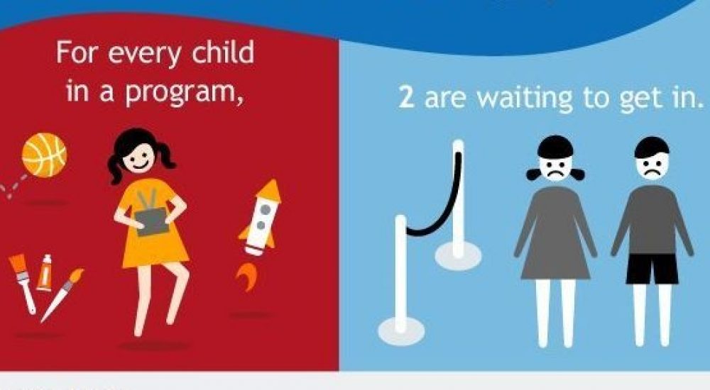
Infographics not only appeal to visual learners, but help everyone access and make sense of information. We have so many things competing for our attention at any given moment. My text on a website explaining the need for additional slots in afterschool programs may get lost; however, check out this handy infographic:

Clearly, infographics are useful but researchers aren’t the only ones who should be thinking about how to present data in a meaningful way. I think everyone should stop and think about how to present important information.
And, if you do, here are a few resources to get you started:
• https://piktochart.com/
• https://www.easel.ly/
• https://infogr.am/
A special thanks to my colleagues, Deb Moroney, Lisa Shimmel, Laura Shankland, and Jessy Newman for letting me pick their brains about data visualization and infographics.
For breakfast this morning, I had mango Greek yogurt with granola, chia, and raisins.
Author Profile: @jaimesinger